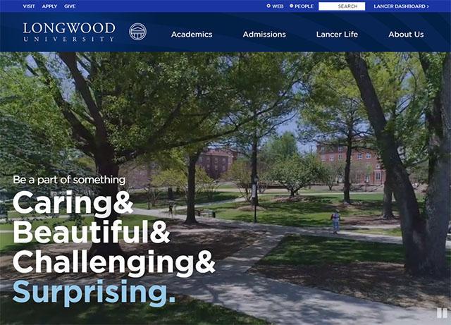
On Sunday, March 1, we’ll be freshening up the Longwood.edu homepage with some noticeable improvements in usability, look and feel, and accessibility, and we’re excited to share these changes with you! You can preview the new homepage by clicking on the special preview link at the bottom of this article, but first here’s a look at some of the improvements. (One thing to note: These changes will affect only the longwood.edu homepage at this time—not the entire website.)
New Full-Screen Video on the Homepage
The first thing you’ll likely notice is that the photo montage is replaced with a very short, looping background video highlighting aspects of life at Longwood. This new full-screen video gives us a fresh medium to really show off the University. Want to stop the video? No problem, just hit the pause button in the lower-right corner (upper-right on mobile).

New Program Search Functionality on the Homepage
Just below the video, you’ll find new functionality that allows prospective students and families to easily search/filter and find an academic program of interest, taking them directly to the specific page for that program. Visitors will find this feature allows them to quickly navigate the website, and it showcases the breadth of our academic offerings.

Additional Improvements on the Homepage
The redesigned homepage focuses heavily on the mobile experience with less copy and big, bold fonts. In addition, we’ve been able to improve accessibility for visitors with disabilities, as well as make the page load faster.
We hope you like it as much as we do, and we’d love to hear what you think. Drop us a note at webteam@longwood.edu with any comments, feedback and/or suggestions. Thanks!
